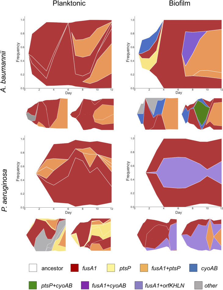
FIG 3.
Evolutionary dynamics of bacterial populations in increasing concentrations of tobramycin. Muller plot diagrams display the genotype frequencies as a proportion of the population throughout 12 days of evolution for three populations per treatment. Genotypes are shaded by the putative driver loci that are mutated. Different lineages of the same color represent mutations at different positions within the same locus that coexist within the population. The frequency of genotypes at every time point is represented by the height of the graph that it spans at that time point. In situations in which a first mutation arises in the background of the ancestral genotype, the color representing that genotype can be seen beginning from the white background, whereas in situations in which a mutation arises in the background of another mutation, thus generating a new genotype, the new color arises in the middle of the existing genotype. Mutations occurring in the background of putative driver mutations are not shown but may be viewed in linear allele frequency plots of each population in Fig. S4 in the supplemental material.

