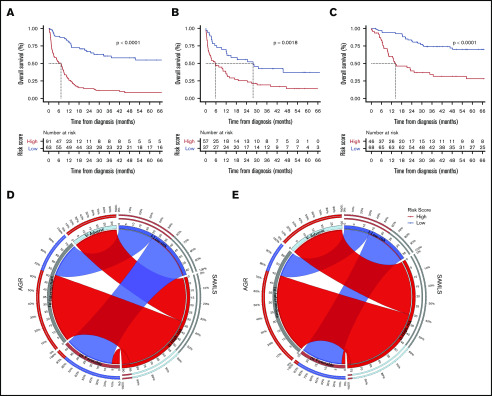
Figure 4.
OS Kaplan-Meier curves for SAMLS. (A) FMUSP. (B) FMRP. (C) OUH. Circos table in FMUSP (D) and OUH (E) illustrating the shared information between AGR (left) and SAMLS (right); the inner ring depicts the absolute information within each risk category for AGR (brown, FR; gray, IR; and bright blue, AR) and for SAMLS (blue, LR; red, HR); the outer ring shows the percentage of that information that is shared between the 2 classification systems (eg, 66% of AGR IR become SAMLS HR in FMUSP); the ribbons illustrate the absolute number from AGR that will compose each SAMLS category and from where they come.

