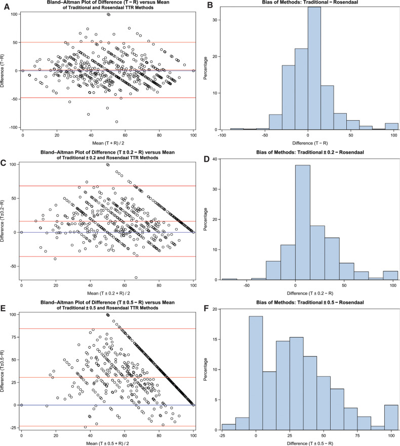
Figure 3:
Bland–Altman plots for difference (T − R) versus size (T + R / 2) with frequency of bias plots. The blue line represents zero difference; the red lines represent mean difference ± two × standard deviation of the difference. A and B: Traditional and Rosendaal; C and D: traditional ± 0.2 and Rosendaal; E and F: traditional ± 0.5 and Rosendaal. TTR: time in therapeutic range; T: traditional; R: Rosendaal.

