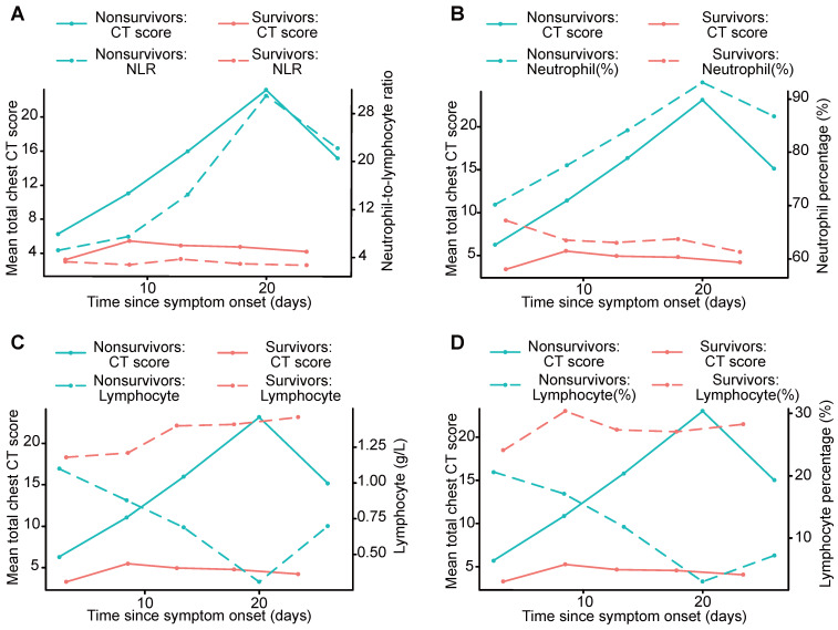
Figure 3.
Graph shows the mean chest CT scores and the NLR, neutrophil percentage, lymphocyte count and lymphocyte percentage plotted for different periods, including survivors and nonsurvivors. The curves for mean chest CT scores showed temporal trends that were consistent with those of the NLR and neutrophil percentage, and divergent points between the outcome groups were present in the second period (A, B). The curves for mean chest CT scores showed temporal trends that were opposite those of the lymphocyte count and lymphocyte percentage (C, D). NLR: neutrophil-to-lymphocyte ratio.

