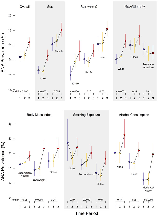
Figure 1. Prevalence of antinuclear antibodies (ANA) by time period in the U.S. population and selected subgroups.
Each circle represents a weighted estimate of ANA prevalence and the vertical bar denotes its 95% confidence interval, with blue coloring for Period 1 (1988-1991), yellow for Period 2 (1999-2004), and red for Period 3 (2011-2012). The estimates for the three periods are connected by black lines to visualize time trends. For each period, the prevalence estimate was derived from a logistic regression model for ANA positivity that adjusted for the survey design variables (strata, clusters, and sampling weights) and a single categorical covariate for the characteristic defining the subgroup. Participants with missing subgroup data (for BMI, smoking exposure, or alcohol consumption) were excluded from those analyses. The P value to assess the strength of evidence for an ANA time trend is displayed below each characteristic category and was derived from a logistic regression model that additionally adjusted for sex, age, and race/ethnicity.

