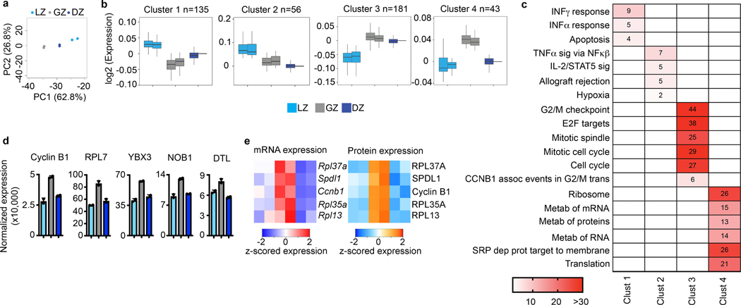
Figure 3. Proteomic analysis of GCBC subsets.
a, Total proteome PCA plot of the indicated cell populations. Each dot corresponds to an independent biological sample. b, Box plots of proteomic clustering analysis. Boxes represent interquartile ranges (IQRs; Q1–Q3 percentile) and black vertical lines represent median values. Maximum and minimum values (ends of whiskers) are defined as Q3 + 1.5× the IQR and Q1 − 1.5× the IQR, respectively. c, Pathway analysis for the indicated protein clusters. Numbers and color correspond to -log10 p value. For each cluster, n= the number of proteins indicated in panel (c). P values were generated by Metascape using an established hypergeometric test coupled with Benjamini-Hochberg p-value correction algorithm. d, Normalized protein expression for example proteins upregulated in the GZ. e, Heatmaps of gene expression (left) and protein expression (right) for the indicated genes/proteins upregulated in GZ B cells. For total proteome data, n=2 per cell type. Cells were isolated from a total of 120 mice. Each n was generated from 5–6 million purified B cell subsets. See also Extended Data Fig. 3 and Supplementary Data 4.

