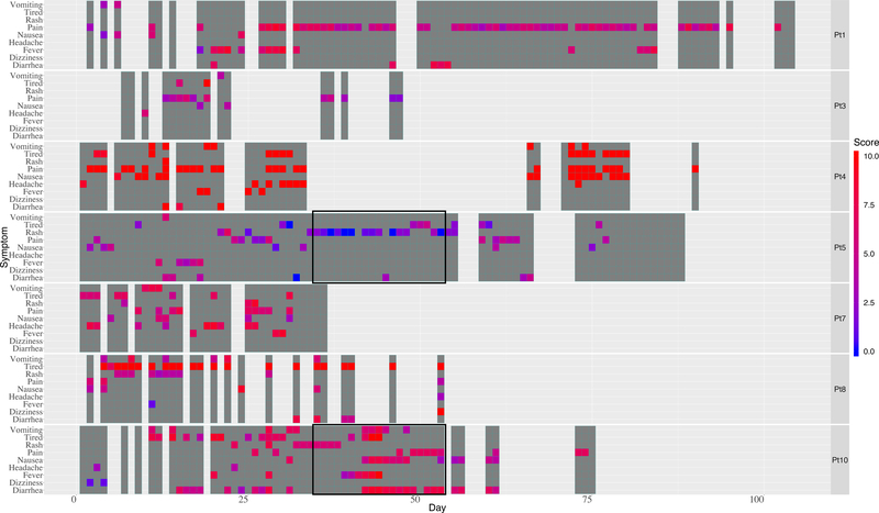
Figure 2.
Heat Map Visualization
Figure 2.1. The heat map allows visualization of complex longitudinal data. The seven patients are listed at the right of each row. Dark gray represents a day the child engaged with the app. Symptom occurrence and intensity are depicted by bright colors ranging from blue (low intensity) to red (high intensity) correlating to a numeric scale from 0–10.
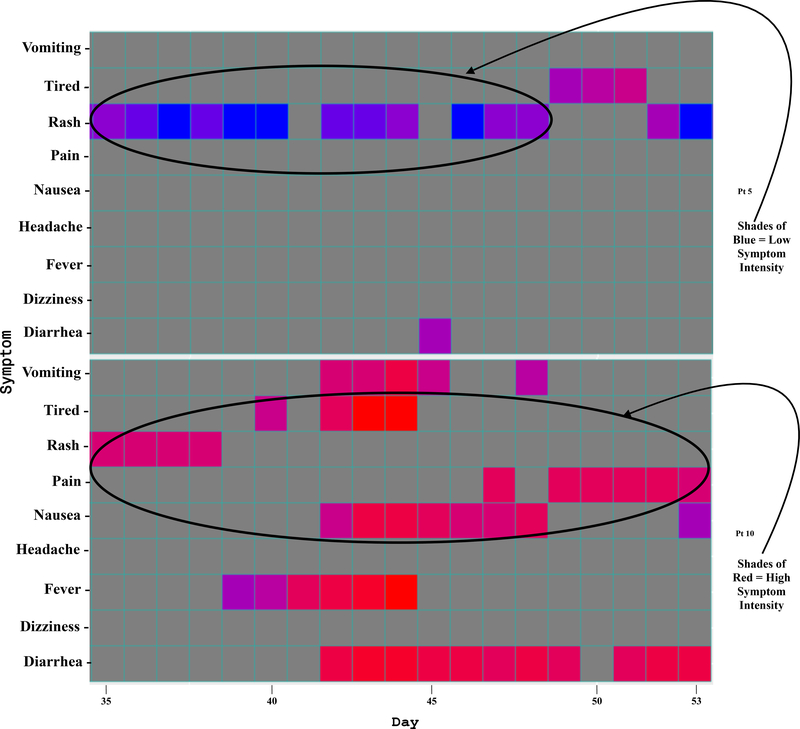
Figure 2.2. A zoom view of two segments of the heat map depicting symptom intensities with color.


