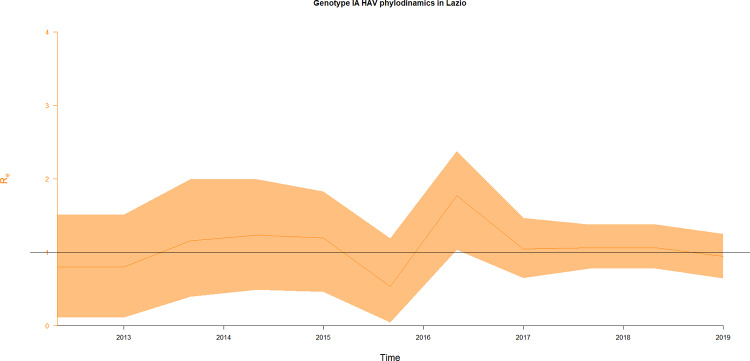
Fig 5. Birth–death skyline plot of HAV in Lazio.
Plot of Birth–death skyline on the entire dataset of every unique VP1X2A junction sequences, based on data from Lazio region in the 2013–2018 interval. The orange line represents the median estimates for the effective reproduction number (Re), while the yellow area represents its HPD intervals.

