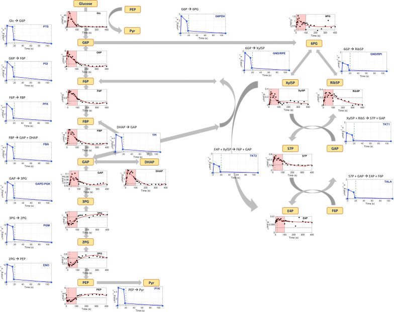
Fig. 4.
Network model used for the flux balance analysis. Metabolite names are shown in yellow text boxes. Under each metabolite, its intracellular concentration (μmol/gCDW) (extracellular only for glucose) over time (s) is shown. Black dots represent the measurements, the red line is the PWA fitted line and black dashed lines represent the average steady-state levels. Green vertical dashed lines show the end of the feeding (20 s). The pink area represents the substrate feast phase. The blue line plots show the FBA estimated flux profiles in μmolreaction_substrate/gCDW/s, where the blue dots are the values at the breakpoints. Fluxes are shown up to 110 s and they were all zero afterwards until the end of the cycle

