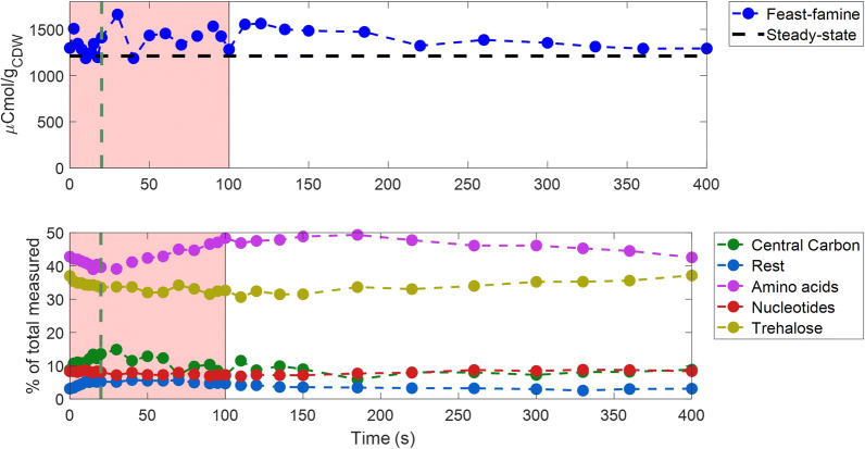
Fig. 7.
Intracellular metabolites and carbon distribution over time. Top: Total amount of intracellular metabolites measured (in μCmol/gCDW) over a feast–famine cycle (s). The black horizontal dashed line represents the average steady-state levels. Bottom: The carbon distribution (% of the total intracellular metabolome measured) in metabolites of different categories/pathways, over a feast–famine cycle(s). Green vertical dashed lines show the end of the feeding (20 s). The pink area represents the substrate feast phase. The detailed list of metabolites for each category can be found in Additional file 1: S10

