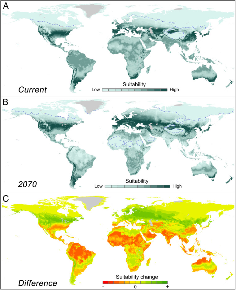
Fig. 4.
Projected geographical shift of the human temperature niche. (Top) Geographical position of the human temperature niche projected on the current situation (A) and the RCP8.5 projected 2070 climate (B). Those maps represent relative human distributions (summed to unity) for the imaginary situation that humans would be distributed over temperatures following the stylized double Gaussian model fitted to the modern data (the blue dashed curve in Fig. 2A). (C) Difference between the maps, visualizing potential source (orange) and sink (green) areas for the coming decades if humans were to be relocated in a way that would maintain this historically stable distribution with respect to temperature. The dashed line in A and B indicates the 5% percentile of the probability distribution. For an analysis including precipitation effects, see SI Appendix, Fig. S10.

