
Figure 3.
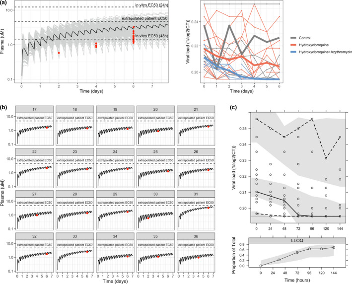
Data and model for clinical data. (a) Raw pharmacokinetic (PK) and viral load data. In the PK graph, raw data is shown in red, whereas black and grey lines represent the typical and population plasma PK simulation (n = 200) using the PK model. In vitro half‐maximal effective concentration (EC50s) indicated in the graph were calculated considering total drug using the values reported in Yao et al. 3 In the viral load graph (left), thick lines represent the mean profiles of each group, whereas the thin ones represent the individual profiles. (b) Individual PK plasma profile predicted with the PK model for each patient treated with hydroxychloroquine (HCQ). (c) Visual predictive check of population PK/pharmacodynamic model. The solid continuous line represents the 50th percentile of the observations, dashed lines represent 2.5th and 97.5th percentiles of observations, and shaded areas represent the 95% prediction intervals for median, 2.5th, and 97.5th percentiles obtained from 1,000 simulated datasets. The lower panel shows the proportions of below the limit of quantification values observed (solid line), with 95% prediction variability shown by shaded area. CT, cycle threshold; LLOQ, lower limit of quantification.