
FIGURE 1.
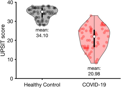
UPSIT scores of the COVID‐19 patients compared to those of healthy controls. The distribution of the participants’ scores in each group is depicted in violin plot. The white circles indicate the median of the score for each group. COVID‐19 = coronavirus disease 2019; UPSIT = University of Pennsylvania Smell Identification Test.