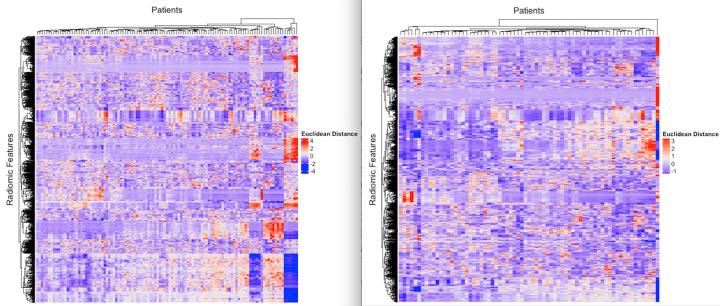
Figure 4:
Heatmaps represent unsupervised analysis of radiomic features in the rows and patients in the columns. The color scale reflects the Euclidean distance between radiomic features (red = high distance, white = 0 distance, purple = low Euclidean distance). The left panel is the Stanford cohort, and the right panel is The Cancer Genome Atlas cohort.

