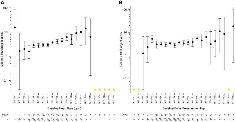
Figure 2.
(A) All-cause mortality and heart rate. Rate of death per 100 subject years is shown, grouped in 5 b.p.m. categories according to baseline heart rate. The number of study participants at risk and the number who died are shown below the x-axis. (B) All-cause mortality and pulse pressure. Rate of death per 100 subject years is shown, grouped in 5 mmHg categories according to baseline pulse pressure. The number of study participants at risk and the number who died are shown below the x-axis. Note: A yellow triangle represents categories where there were zero deaths, so a rate could not be calculated.

