
Figure 2.
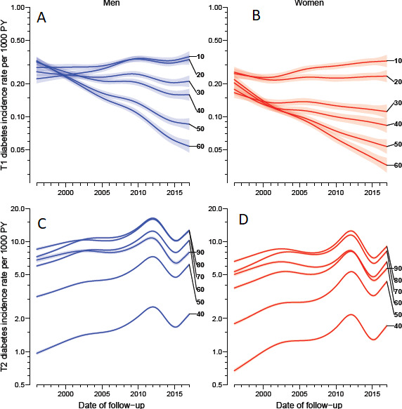
Age-specific incidence rates in different ages as of 1 January 2015, derived from age–period–cohort models. Note the different y-axes in the upper and lower panels but that the relative extent of the axes is the same for type 1 diabetes and type 2 diabetes. Blue curves are men, red curves women; shaded areas represent 95% CIs. (A) men, type 1 diabetes; (B) women, type 1 diabetes; (C) men, type 2 diabetes; (D) women, type 2 diabetes.