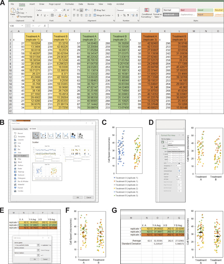
Figure S3.
Tutorial for making SuperPlots in Excel. (A) To make a SuperPlot using Excel (Microsoft Office 365 ProPlus for Windows; version 1912; Build 12325.20172), enter the values for the first replicate for the first condition into column B (highlighted in yellow), the second condition into column D (highlighted in yellow), and continue to skip columns between datasets for the remaining conditions and replicates (in this example, replicate 2 is highlighted in green and replicate 3 is in orange). For example, “Treatment A” could be control cells and “Treatment B” could be drug-treated cells. Label the empty columns as “x” and, starting with column A, enter random values to generate the scatter effect by using the formula “=RANDBETWEEN(25, 100)”. To create a gap between the datasets A and B, use larger X values for treatment B by entering the formula “=RANDBETWEEN(225, 300)”. (B) Highlight all the data and headings. In the insert menu, expand the charts menu to open the “Insert Chart” dialog box. Select “All Charts,” and choose “X Y Scatter.” Select the option that has Y values corresponding to your datasets. (In Excel for Mac, there is not a separate dialog box. Instead, make a scatter plot, right click on the plot and select “Select Data,” remove the “x” columns from the list, then manually select the corresponding “X values =” for each dataset.) (C) Change the general properties of the graph to your liking. In this example, we removed the chart title and the gridlines, added a black outline to the chart area, resized the graph, adjusted the x axis range to 0–325, removed the x axis labels, added a y axis title and tick marks, changed the font to Arial, and changed the font color to black. This style can be saved as a template for future use by right clicking. We recommend keeping the figure legend until the next step. (D) Next, double click the graph to open the “Format Plot Area” panel. Under “Chart Options,” select your first dataset, “Series Treatment A (replicate 1).” (On a Mac, click on a datapoint from one of the replicates, right click and select “Format Data Series.”) Select “Marker” and change the color and style of the data points. Repeat with the remaining datasets so that the colors, shapes, etc. correspond to the biological replicate the data points came from. Delete the chart legend and add axis labels with the text tool if desired. (E) Calculate the average for each replicate for each condition, and pair this value with the X coordinate of 62.5 for the first treatment, and 262.5 for the second treatment to center the values in the scatterplot. Then, click the graph, and under the “Chart Design” menu, click “Select Data.” Under “Legend Entries (Series),” select “Add” and under series name, select the three trial names, then select all three X and Y values for first treatment condition for “Series X Values” and “Series Y Values,” respectively. Repeat for the second treatment condition, and hit “OK.” (F) On the chart, select the data point corresponding to the first average and double click to isolate the data point. Format the size, color, etc. and repeat for remaining data points. (G) Optional: To add an average and error bars, either generate a second graph and overlay the data, or calculate the average and standard deviation using Excel and add the data series to the graph as was done in E and F, using the “-” symbol for the data point.

