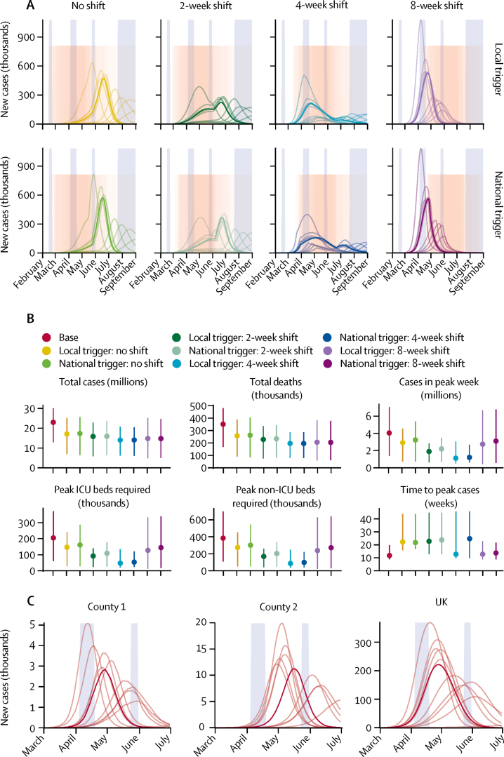
Figure 3.
Local versus national triggering and timing of interventions
(A) Dynamics of the epidemic under local versus national triggers for introduction of the combined intervention (pink shaded regions). Tall blue shaded regions show regular school holiday closures whereas the pink shaded region shows the intervention period. From 200 realisations of each projection, 11 representative simulations are shown: one for each decile of the total number of new cases, with the bold curve showing the simulation resulting in the median projected daily incidence of cases. (B) Summary of simulated outputs in total number of clinical cases and deaths, clinical cases in the peak week, peak ICU beds required, peak non-ICU beds required, and the time from seeding until the peak of the epidemic. Vertical bars indicate 95% prediction intervals. (C) Illustration of peak timings of new cases varying across two counties in the UK, in comparison with predicted national trends, for a single simulation with no control interventions. Blue shaded regions show regular school holiday closures. Divisions on the x-axis in panels A and C show the beginning of each calendar month. ICU=intensive care unit.

