
Figure 2.
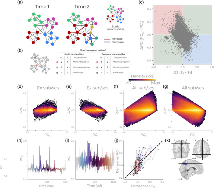
The different PC calculation methods lead to different interpretations of the network's organization. (a) An example network consisting of multiple communities for two time points. The figure shows both a temporal community partition and a static community partition. Red lines at time point 2 indicate an increase in connectivity, and blue lines indicate a decrease. (b) Different types of nodes from (a) are highlighted. The accompanying table states how these nodes at time point 2 will be quantified relative to time point 1 with static or temporal communities for the participation coefficient (PC) and within‐module degree z‐score (z). (c) The difference in PC and z for nodes in the static and temporal for all nodes/time points for one subject/run in the MSC dataset. The red, blue, and green quadrant corresponds to the interpretations found in (b). (d) Density plot showing the difference in PC versus PC S for the example session/subject in (c). (e) Same as (d) but the difference in PC versus PC T. (f) Same as (d) but for all sessions/subject. (g) Same as (e) but for all sessions/subjects. All density plots have a logarithmic color scale. (h) The PC S through time for an example subject/session/node. The color of the time series is to assist understanding of Panel (k) and changes as the time series progresses. (i) Same as (h) but for the PC T. (k) The PC S and PCT from panels (h) and (i) plotted against each other. The color of each point corresponds to the time illustrated marked in (i,h). (l) Depiction of the example node used in Panels (h–k)