
Figure 5.
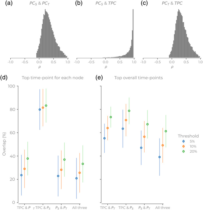
Comparison of the hub overlap for three different participation coefficient (PC) methods. (a–c) The histograms of correlation values for each time series for different participation methods. Histograms show all nodes, sessions, and subjects. (d,e) The intersection of high participation coefficient from different methods. Here, we see the intersection of each combination of three methods. (d) For each subject, the top x% time point for each node. (e) For each subject, the top x% across all nodes and time points. Error bars show SD