
Figure 4.
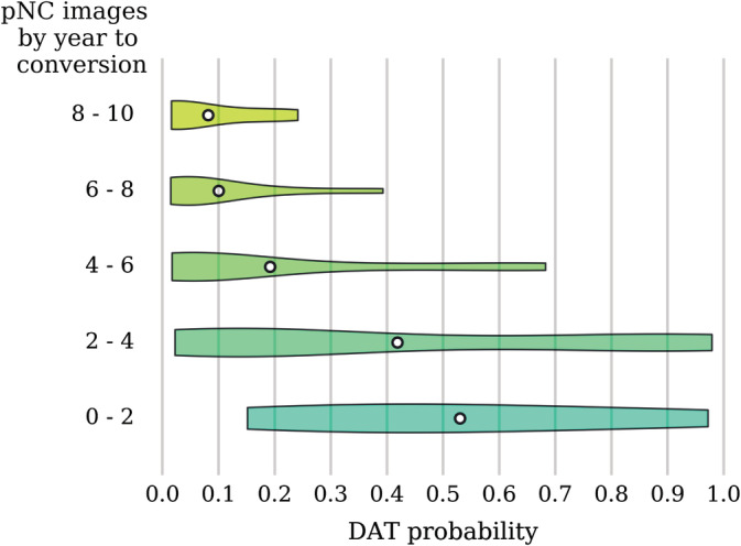
DAT probability scores across pNC images arranged by the time to conversion. The violin plot shows the density (relative proportion of images), while the white dot gives the mean probability. Note that for images taken closer to the time of conversion, there is a trend toward higher probability scores. DAT, Dementia of the Alzheimer's type; pNC, progressive normal control