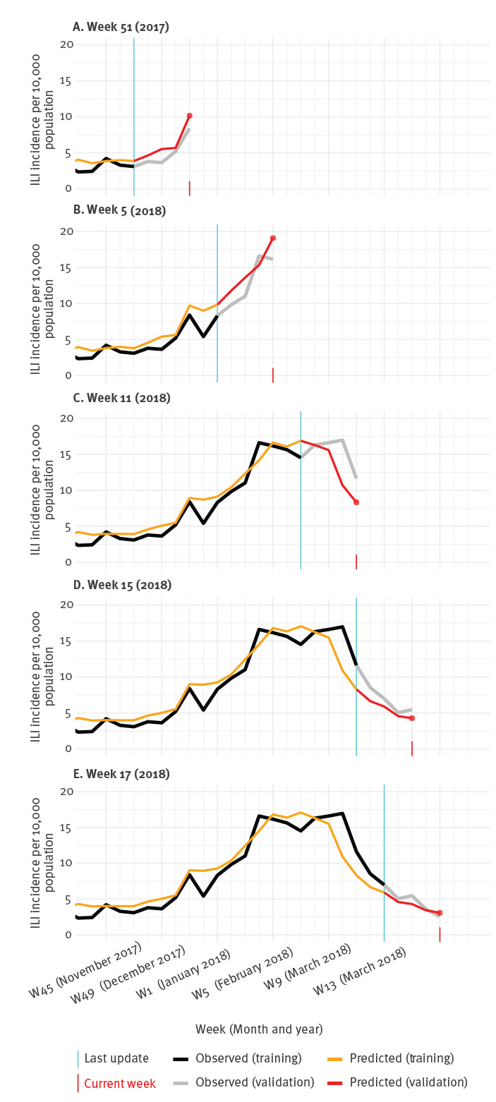
Figure 3.
Observed vs predicted influenza-like illness incidence at five time points (A–E), Netherlands, influenza season 2017/18
ILI: influenza-like illness.
The plots illustrate what information the prediction models would have provided at these five particular points in time (indicated by the red dot and vertical line), if they had been used. The week for which the last official ILI incidence data were made available is marked by the vertical cyan line.

