Fig. 1.
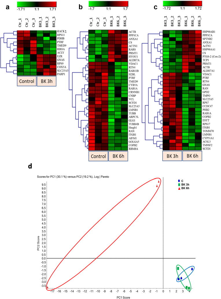
Hierarchical clustering (heat maps) and X showing the different proteins expression profile in the 3 experimental groups: (a) Control vs 3 h BK, (b) Control vs 6 h BK, and (c) 3 h vs 6 h BK. Each row represents a different protein while each column represents one triplicate from the corresponding experimental group. Green color represents downregulation of protein expression, whereas the red color represents upregulation of protein expression. Color intensity reflects the expression level of the proteins (scale). The label on the right-hand side of the heat maps represents the accession number of the proteins. (d) Principal Component Analysis (PCA) of BK-stimulated podocytes. The total normalized expression data of the proteins was used to depict the scatter plots of the first (X) and the second (Y) principal components. The numbering of the nodes is an identification of the samples. Letters used in the labels of the nodes represent the repeats. Blue oval encircles the control samples, green oval encircles the BK 3 h stimulated samples, and red oval encircles the BK 6 h stimulated samples. (For interpretation of the references to color in this figure legend, the reader is referred to the web version of this article.)

