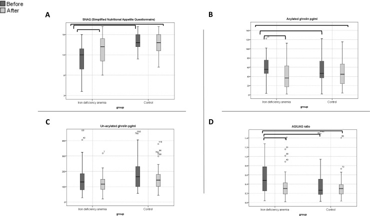
Fig 2. Box plots for SNAQ score, ghrelin levels according to groups, IDA versus healthy control at baseline and after treatment.
The horizontal line inside each box indicates the median, while the bottom and top of each box indicate the 25th and 75th percentile, respectively. The bars indicate the upper adjacent value (75th percentile plus 1.5 time the interquartile range) and the lower adjacent value (25th percentile minus 1.5 times the interquartile range). Empty circles indicate outliers, and brackets indicate statistical significance (P < 0.05).

