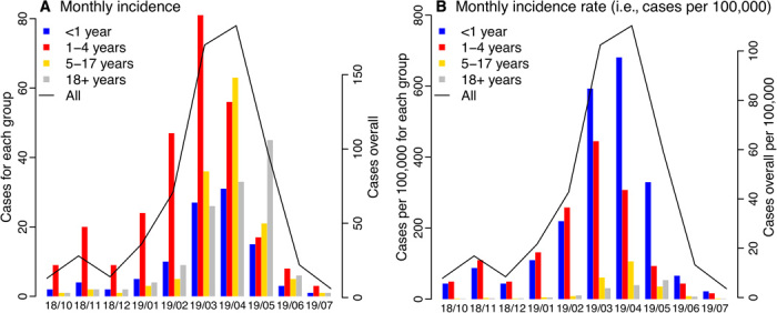
Fig. 1. Epidemic curve.

(A) Monthly incidence and (B) incidence rate (i.e., cases per 100,000 population) for all ages and by age group. The solid line (y axis on the right) shows monthly numbers for all ages, reported as of 6 August 2019. For comparison, bars (y axis on the left) show monthly numbers for <1-year-old (blue), 1- to 4-year-olds (red), 5- to 17-year-olds (yellow), and 18+-year-olds (gray), respectively, estimated on the basis of health reports. The x axis shows time in month (yy/mm).
