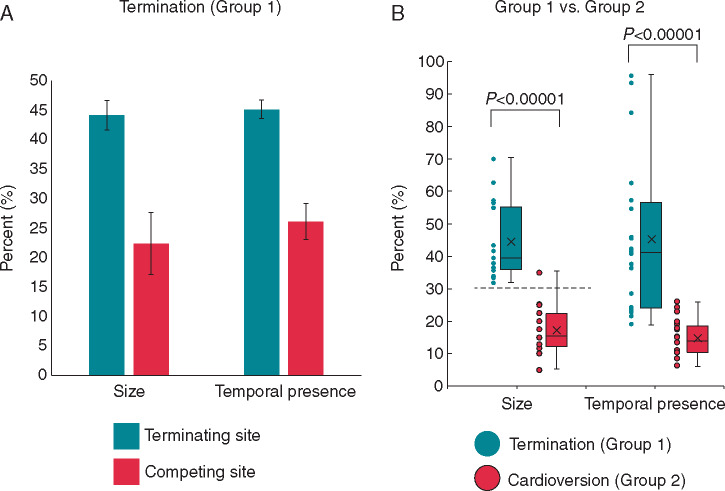
Figure 5.
Comparison of organized areas leading to termination. (A) Bar graph showing organized area size (as % of mapped area) and temporal duration(as % of mapped duration) of sites that led to termination (terminating site, green) compared with the average of cotemporaneous competing areas (competing site, red) prior to termination. (B) Histogram of all organized area sizes and temporal duration that led to termination (green) compared with sites prior to cardioversion (red). Error bars represent standard error of means.

