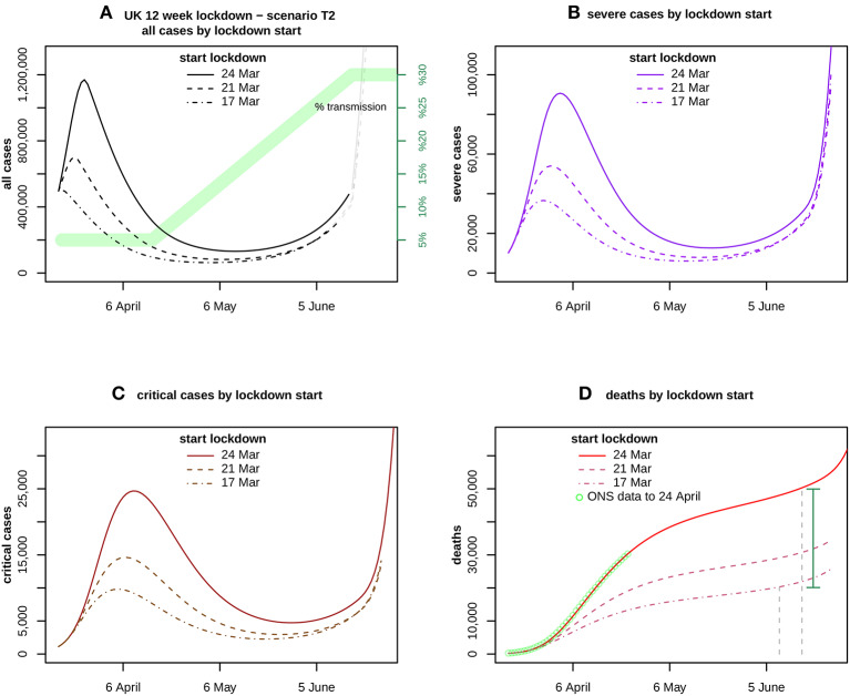
Figure 4.
Assumes a transmission scenario T2 as indicated in (A) by the green band. It compares the forecasts for (A) all cases, (B) severe and (C) critical cases, and (D) deaths. ONS data up to 24 April is also shown in (D). The curves compare the impact of lockdown start dates 24 March (solid), 21 March (dashed), and 17 March (dotdash). The vertical distance between the solid curve at 16 June and the dotdash curve at 9 June, is the estimated excess caused by delaying the lockdown for 1 week, shown by the green vertical bar.

