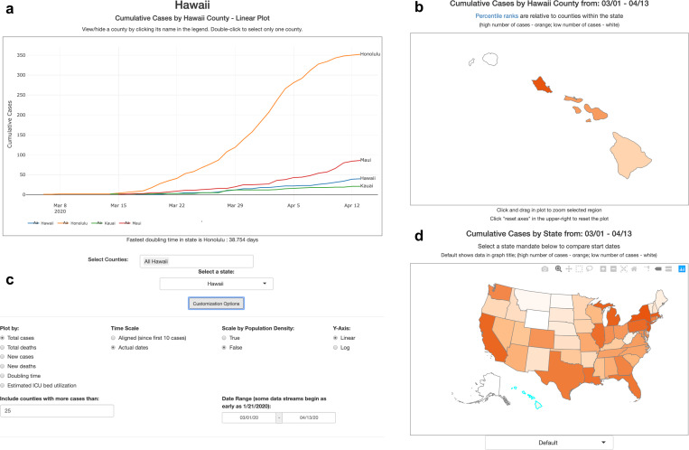
Figure 4: Overview of CovidCounties.org.
A. The primary view of CovidCounties.org is the line plot view, depicting time-series trends by individual county. Depicted counties may be selected by single or double clicking the counties displayed in the legend. They may also be selected by typing in counties (including from outside of a given state) at the bottom.
B. User-selected individual states are color coded according to the variable of interest (e.g. cumulative cases). Dark orange corresponds to the highest percentiles within the state, white indicates the lowest percentile. Hovering functionality displays statistics corresponding to a given county.
C. Line plot views can be extensively customized, with features to enable axis re-centering/scaling, count normalization, depiction of doubling time, and predicted ICU bed utilization. Individual state and United States plots update to reflect selected parameters where appropriate.
D. States within the United States are color-coded by percentile according to the variable of interest (e.g. cumulative cases). Dark orange indicates relatively high percentile (among states), white indicates low percentile. Hovering functionality displays statistics corresponding to a given state. The dropdown menu below allows the user to change the view to depict timing that various social distancing policies were implemented: white indicates relatively early adoption (by percentile), dark orange indicates late or no current adoption.

