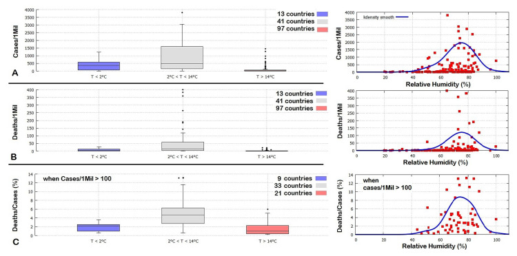
Figure 8.
Left panels: Boxplots of country distribution in function of their March mean temperature, relative to the number of COVID-19 cases (A) and deaths (B) per million people, and the percent of deaths per cases (C). In (C) only the countries with more than 100 cases/1Mil were considered to reduce statistical volatility. See the supplementary file for the data. Right panels: equivalent scatterplots in function of the March mean relative humidity for the same countries (red) with the correspondent k density smooth function (blue).

