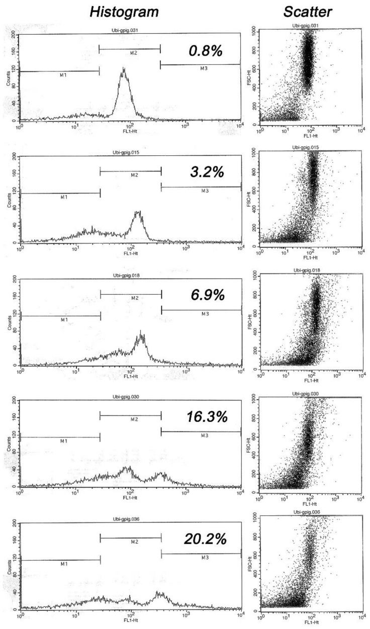
Figure 1.
Flow cytometric histograms of ubiquitin-induced fluorescence in five males, ranked top-to bottom from lowest to highest sperm ubiquitin content (% ubiquitinated spermatozoa within marker area M3 is shown): Note a progressive shift of histogram towards M3 area, resulting in a distinct second peak in high ubiquitin samples. Such a trend is mirrored by scatter diagrams of visible light in the right column (each dot represents one cell/flow cytometric event), where the events in the lower left corner represent undesirable abnormal cells and debris while the focus of dots spanning from scatter center to upper right corner represents the cells of normal/desirable size and shape.

