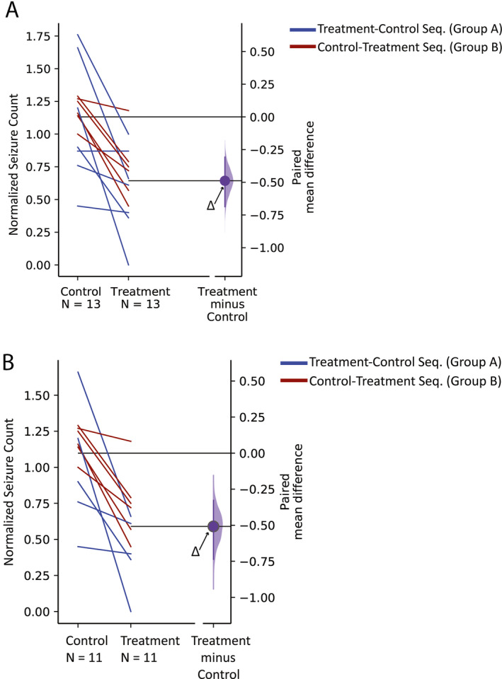
FIGURE 2.

Estimation graphics to display the effect size under (A) intention to treat (n = 13) and (B) per‐protocol (n = 11) analysis. The blue and red lines connect the paired observations on the seizure counts during the control and treatment periods for individuals in groups A and B, respectively. Horizontally aligned with the mean of the treatment group, the purple curve represents the resampled distribution of the mean differences between the seizure counts during the control and treatment periods or Δ, indicated by the purple circle. The axis origin, indicated by a black horizontal line, by definition represents the mean of the null hypothesis and is equal to zero
