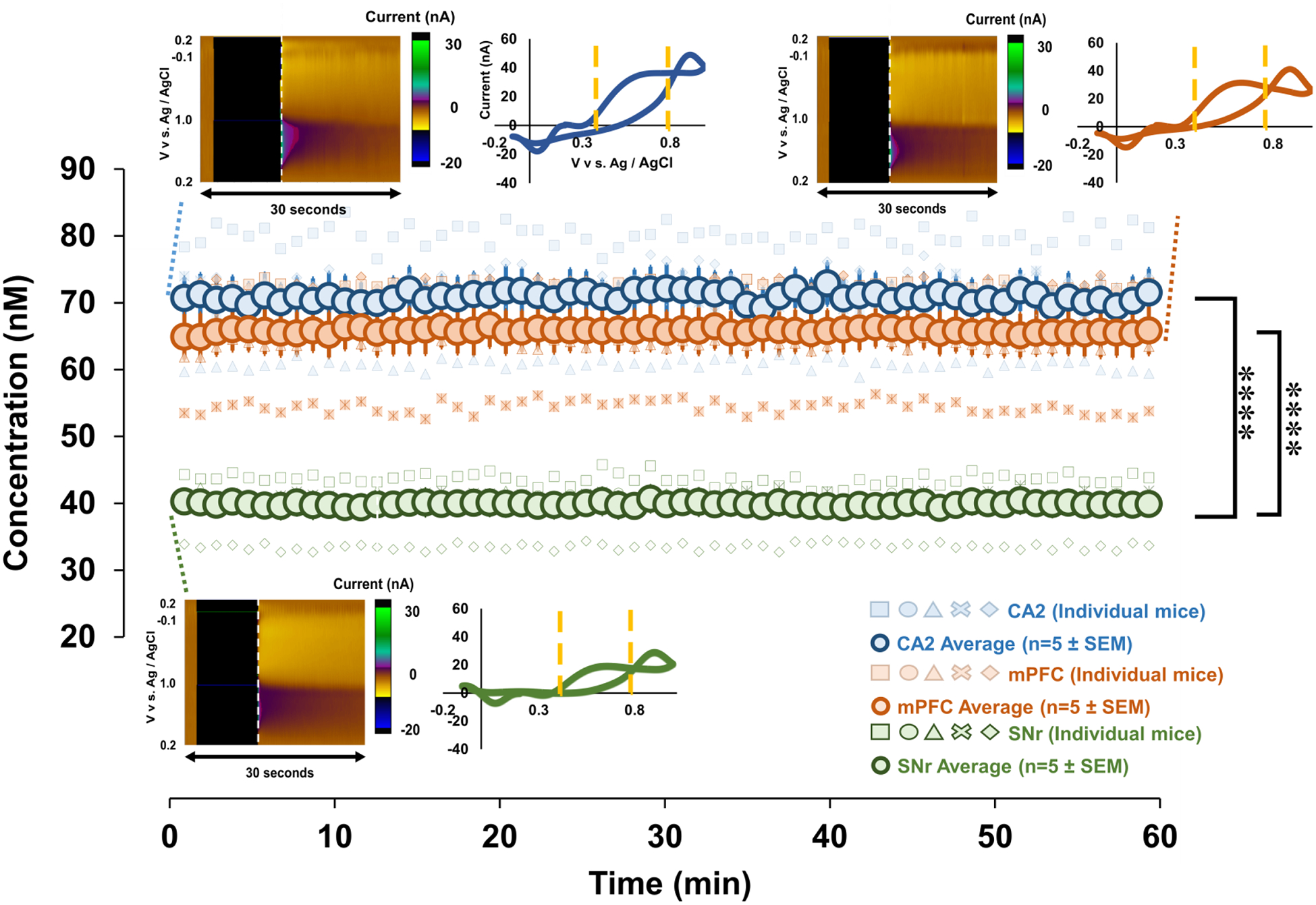
Figure 4.

Blue, orange and green circles represent the weighted averaged response (n=5 mice each region ± SEM), and faint blue, orange, and green markers represent individual mice responses. Files were collected for 60 mins to obtain a baseline reading. Representative FSCAV color plots and CVs (extracted from vertical dashed lines) are inset, on top left for the CA2, top right for the mPFC, and at the bottom for SNr. Yellow lines on the CV denote the limits of integration. ****p<0.0001.
