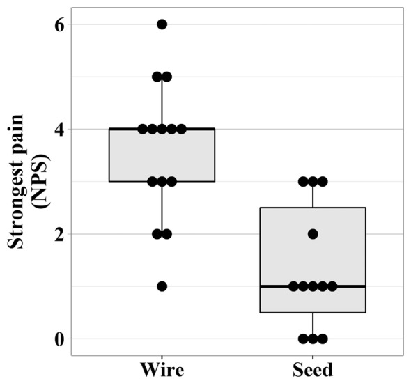
Figure 4. Boxplot together with individual data points shows the level of strongest pain on the numerical pain scale (NPS) after the localization procedure (Mann-Whitney U-test: p<0.001). The boxplots illustrate the median (bold line) and 25th and 75th percentiles (box) of the samples. Whiskers represent the data range excluding outliers (values extending more than 1.5× interquartile range from the upper and lower box limits).

