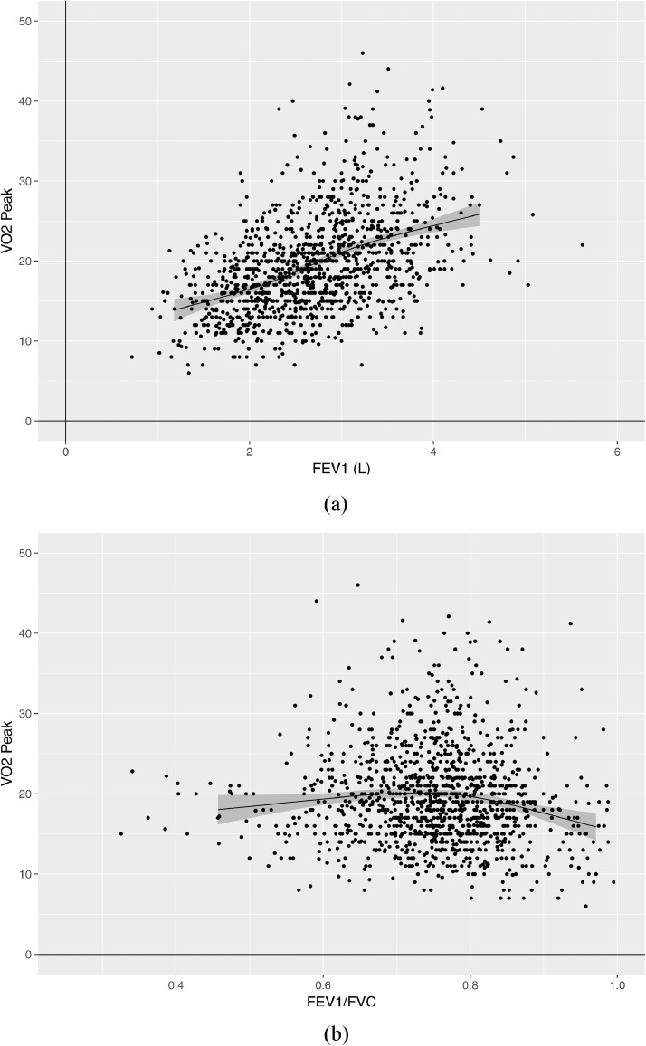
Fig. 1.
Correlation of FEV1 and FEV1/FVC versus peak oxygen consumption (VO2 peak). Panel A is a scatter plot presenting the association of peak oxygen consumption (VO2 peak – shown on y-axis) and forced expiratory volume in 1 s (FEV1 – shown on x-axis). The plotted line is a line of best fit (estimated using restricted cubic splines), while the grey shaded zone represents its 95% confidence limits. Panel B is a scatter plot presenting the association of peak oxygen consumption (VO2 peak – shown on y-axis) and the ratio of FEV1 to forced vital capacity (FEV1/FVC – shown on x-axis). The plotted line is a line of best fit (estimated using restricted cubic splines), while the grey shaded zone represents its 95% confidence limits.

