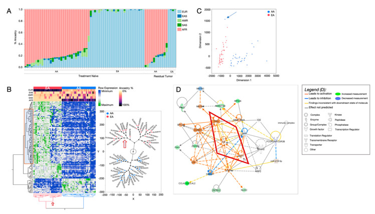
Figure 1.
Differentially expressed genes (DEGs) associated with quantified genetic ancestry (QGA) in treatment-naïve TNBC RNA-seq. (A) QGA estimates for each cancer case, derived from RNAseq variants. Geographic ancestry super-group categories are indicated as European (EUR, light blue), East Asian (EAS, dark blue), American Native (AMR, light green), South Asian (SAS, dark green), and African (AFR, pink). Samples are grouped by treatment status (treatment naïve or residual tumor) and self-reported race (SRR). (B) Clustergram heatmap of the 156 (p < 0.05) genes that show differential expression levels by QGA, where rows represent genes and columns represent individuals. SRR is shown in the top row of the color map (red indicating EA, and blue indicates AA); the remaining color map rows indicate ancestry estimations for each individual. The red box indicates genes that are associated with non-European admixture (EAS, SAS, and AMR). Constellation plot, right, representing the hierarchical structure of the individuals shown at the bottom of the heatmap. Red dots indicate SRR EAs; blue dots are SRR AAs. The red arrow points to the substrata of EA individuals with increased admixture; this corresponds to the non-European admixture genes in the red box of the heatmap. (C) Multidimensional analysis using 156 ancestry-associated genes indicates that the expression patterns separate individuals into SRR groups. Red indicates EA, and blue indicates AA. The blue arrow indicates an individual that self-reported as EA but has mostly AFR ancestry, clustering with the AA group. (D) De novo network analysis using QGA DEGs using Ingenuity Pathway Analysis (IPA) software. Molecules in green are upregulated in individuals with increased AFR ancestry; those in blue are downregulated in individuals with AFR ancestry. Molecules in orange are drawn into the network and predicted to be activated based on the state of DEGs in the network, using published interactions from the curated Ingenuity Knowledge Base. Orange lines between molecules indicate relationships leading to activation; blue lines indicate relationships leading to inhibition. Yellow lines indicate that the relationship between two molecules is not in the expected direction. For example, in this network TP53 is known to inhibit AKT1. TP53 is activated, and so it is expected that AKT1 would be downregulated. However, it is not. Because of this, the line showing the interaction between these two molecules is shown as yellow.

