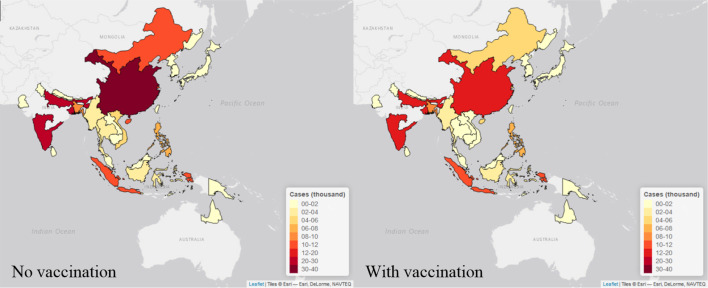
Figure 6. Maps of estimated cases (in thousand) in 30 endemic areas for two scenarios in 2015.
Each endemic area is shaded in proportion to the area’s estimated cases in thousand as seen in the legend, with yellow shade is the lowest value and red shade is the highest value. The map on the left is the estimates from no vaccination scenario, and the right is from the vaccination scenario. The maps were made by leaflet package in R (Joe et al., 2017).

