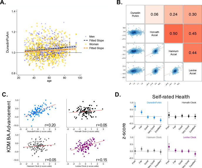
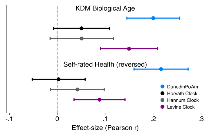
Figure 3. Associations of DunedinPoAm with chronological age, epigenetic clocks, KDM Biological Age, and self-rated health in Understanding Society.
Panel A shows a scatterplot and fitted slopes illustrating the association between chronological age (x-axis) and DunedinPoAm (y-axis) in women and men in the Understanding Society sample. Data for women are plotted with yellow dots (orange slope) and for men with blue crosses (navy slope). The figure illustrates a positive association between chronological age and DunedinPoAm (Pearson r = 0.11 95% CI [0.06–0.17]). Panel B shows a matrix of correlations and association plots among DunedinPoAm and age-acceleration residuals of the Horvath, Hannum, and Levine epigenetic clocks. The diagonal cells of the matrix list the DNA methylation measures. The half of the matrix below the diagonal shows scatter plots of associations. For each scatter-plot cell, the y-axis corresponds to the variable named along the matrix diagonal to the right of the plot and the x-axis corresponds to the variable named along the matrix diagonal above the plot. The half of the matrix above the diagonal lists Pearson correlations between the DNA methylation measures. For each correlation cell, the value reflects the correlation of the variables named along the matrix diagonal to the left of the cell and below the cell. Panel C graphs binned scatterplots of associations of DunedinPoAm and epigenetic clocks with KDM Biological Age advancement (the difference between KDM Biological Age and chronological age). Each plotted point shows average x- and y- coordinates for ‘bins’ of approximately 50 participants. Regression slopes are graphed from the raw, un-binned data. Panel D plots average values of the DNA methylation variables by Understanding Society participants’ self-rated health status. Error bars show 95% confidence intervals.


