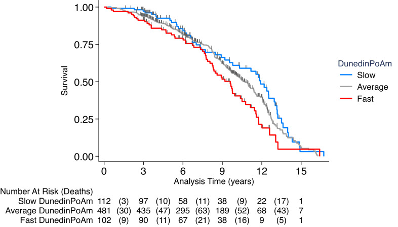
Figure 4. Association of DunedinPoAm with mortality in the Normative Aging Study (NAS).
The figure plots Kaplan-Meier curves for three groups of NAS participants: those with DunedinPoAm 1 SD or more below the mean (‘slow’ DunedinPoAm, blue line); those with DunedinPoAm within 1 SD of the mean (‘average’ DunedinPoAm, gray line); and those with DunedinPoAm 1 SD or more above the mean (‘fast’ DunedinPoAm, red line). Censoring of participants prior to death is indicated with a vertical gray hash mark. The table below the figure details the number of participants at risk per 3 year interval and, in parentheses, the number who died during the interval. The number censored can be calculated by subtracting the number of deaths in an interval from the difference between the number at risk in that interval and the number at risk in the following interval.


