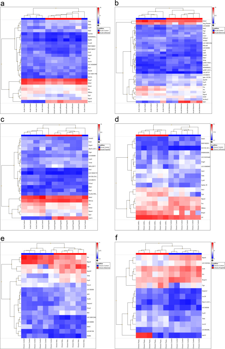
Figure 1.
Heatmap of Treatment comparisons – Log2 average gene expression for each sample compared to appropriate control. The top horizontal axis of the image depicts colour bars indicating the grouping into either control or treatment and shows a hierarchical grouping above the colour coding, the bottom horizontal axis labels the identity of the samples, the right vertical axis labels the genes examined and the left vertical axis clusters the genes into families. The colour scale on the top right of the image allocates a colour based on the scale for each independent value per sample dictating the different gene expression level for every sample. (a) Acute control vs acute isoflurane; (b) acute control vs acute ketamine; (c) acute control vs acute propofol; (d) chronic control vs chronic isoflurane; (e) chronic control vs chronic ketamine; (f) Chronic control vs chronic propofol.

