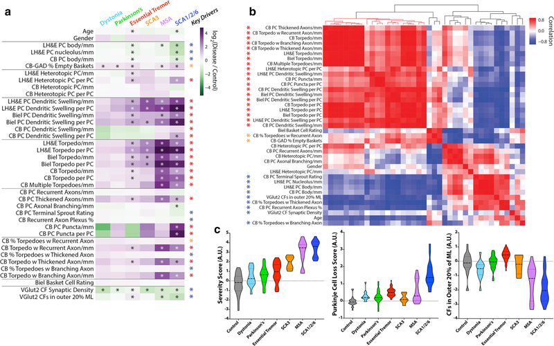
Fig. 3.
Differences in fold-change for each metric across diseases and key pathologic drivers. a Metrics (rows) and diagnoses (columns) are shown. Each cell in the heatmap is the average log2-fold-change (disease vs. control) for each metric. The scale ranges from dark purple (high relative to control) to dark green (low relative to control). Elements with an asterisk indicate a statistically significant difference vs. controls (Mann–Whitney test, p values corrected for false discovery by Benjamini–Hochberg method; *FDR < 0.01). b Hierarchical clustering of the correlation coefficients between all pairwise combinations of metrics, with colored scale of red (positive correlation), white (no correlation) and blue (negative correlation). Prominent positively correlated (red and orange asterisks) or negatively correlated (blue asterisk) observables drive many of the significant differences across disease categories, and are designated as “Key Drivers” in a. c Three scores were computed across disease categories by combining the average fold-change (disease/control) for selected metrics and plotted on a log-transformed scale, including a “Severity Score” (large block of 20 positively correlated red metrics in panel b), a “Purkinje Cell Loss Score” (inverse Purkinje cell body, inverse Purkinje cell nucleolus and percent empty baskets), and a score reflecting climbing fibers (CFs) in the outer 20% of the molecular layer. Within each violin, the dashed line shows the median value and the dotted lines indicate outer quartiles in the data distribution

