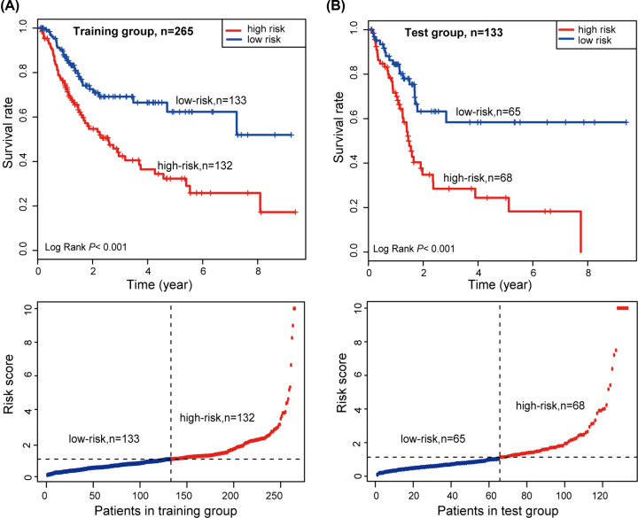
Figure 6. Kaplan–Meier survival curve analysis and risk score of the patients.
(A) According to the median risk score, the training group was classified into high- and low-risk groups. Kaplan–Meier survival curve analysis shows the survival rates of the high- and low-risk groups. P values was calculated by log-rank test. (B) According to the median risk score, the test group was classified into high- and low-risk groups. Kaplan–Meier survival curve analysis shows the survival rates of the high- and low-risk groups. P values was calculated by log-rank test.

