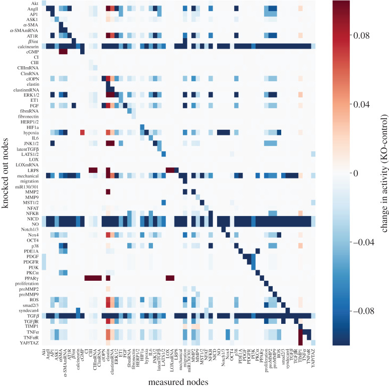
Figure 3.
Heat map of the baseline sensitivity analysis showing changes in activity of all the nodes in the model (columns) in response to knocking out each node (rows), where red indicates an increase in activity over baseline and blue shades indicate a decrease in activity in response to the knockout. (Online version in colour.)

