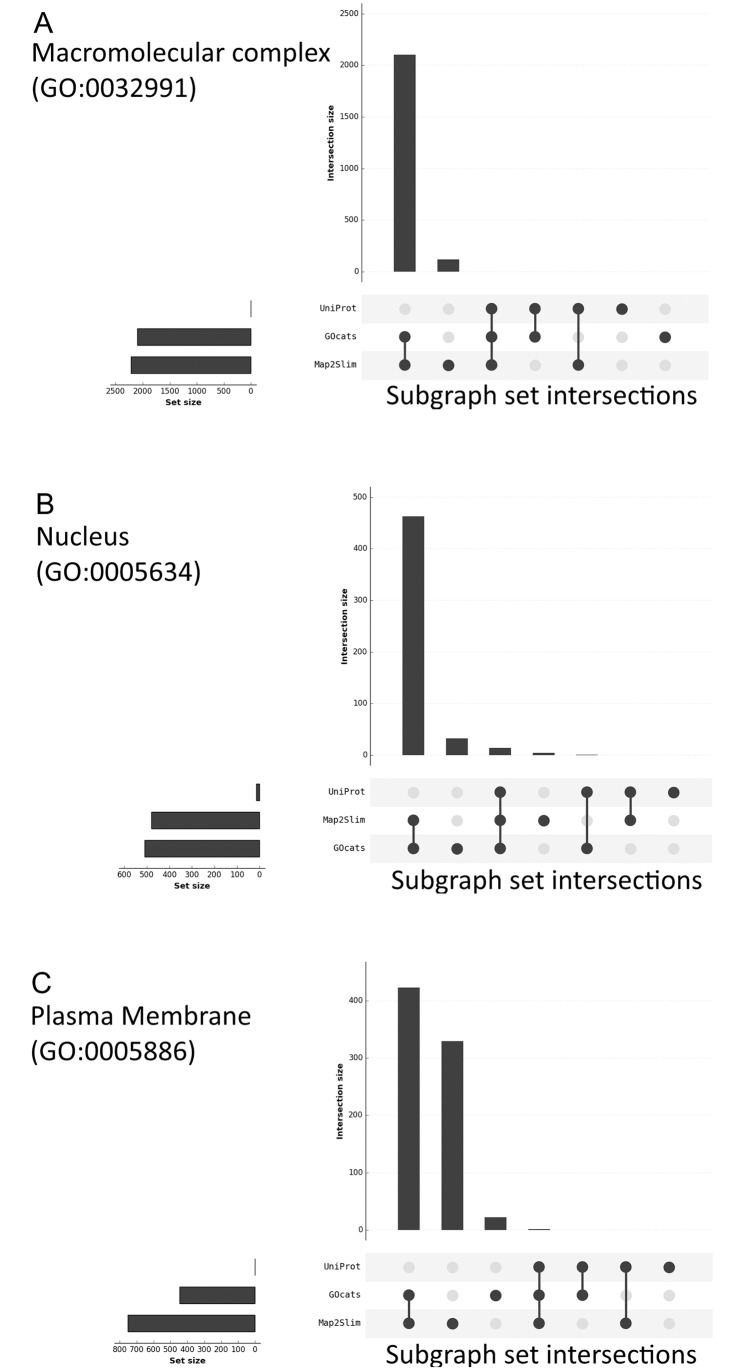
Fig 3. Visualizing the degree of overlap between the category subgraphs created by GOcats, Map2Slim, and the UniProt CV.
Plots were created using the R package UpSetR [25], as a visual alternative to a Venn diagram. The amount of overlap between category-specific subgraphs are indicated by the vertical bar graph with the connected dots identifying which specific mapping method (UniProt, GOcats, and Map2Slim) is included in the overlap. A) Macromolecular Complex; B) Nucleus; C) Plasma Membrane. Plots for all categories can be found in S1(A-Y) Data.

