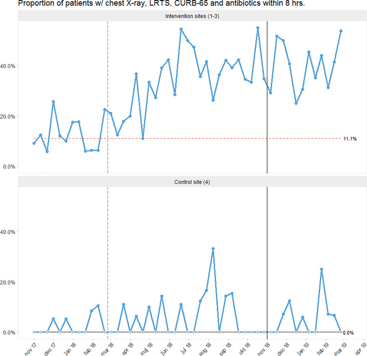
Fig 2. Run chart showing the proportion of patients receiving the CAP care bundle (i.e. chest X-ray, LRTS, CURB-65 and antibiotics) within 8 hours from admission.
Each dot represents 12–48 cases of CAP. The vertical, grey, dashed line marks the beginning of the intervention period. The vertical, black, solid line denotes the beginning of the follow-up period. The process centre (horizontal line representing the median) was frozen after the baseline period. Special cause variation can be identified by a red, dashed process centre (sustained shift) [36]. See S2.1 Fig in S1 File for run charts for the individual intervention sites along with information on the timing of our interventions.

