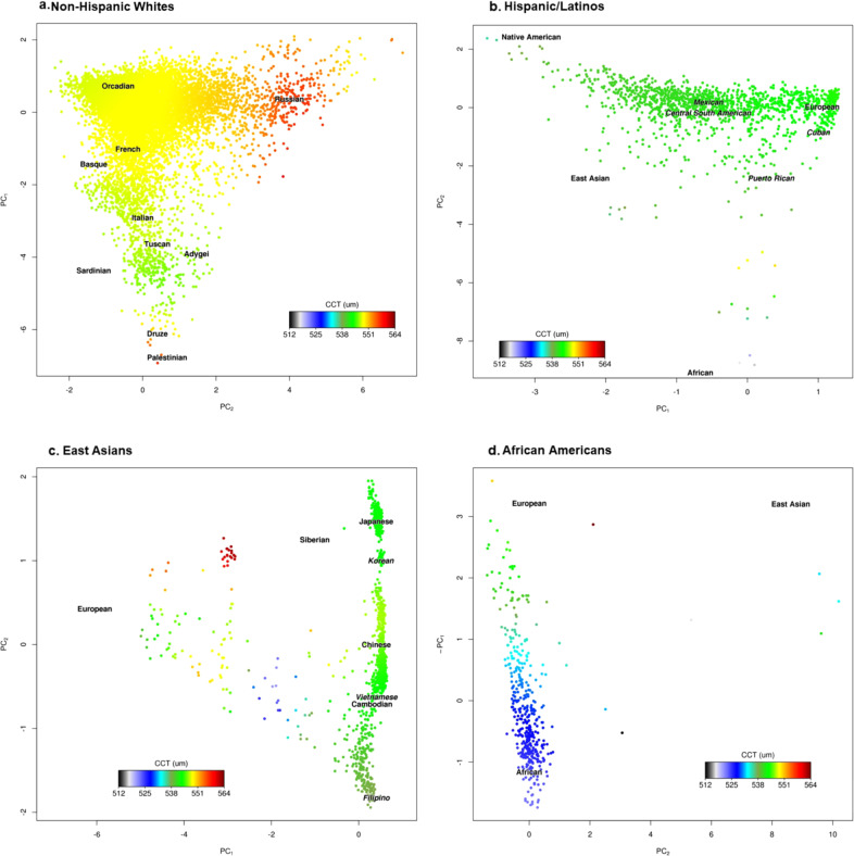
Fig. 1. Plots of CCT distribution versus genetic ancestry in GERA.
CCT distribution is indicated on a color scale, standardized across groups, with warmer colors indicating thicker CCT. Axes reflect the first two principal components of ancestry in each group. The phenotype distribution was smoothed over the PCs (within the individuals in each respective figure), which were divided by their standard deviation for interpretability (see Methods). Human Genome Diversity Project populations are plotted at their relative positions in each figure. Human Genome Diversity Project populations are presented in a plain font, and GERA populations are presented in italics font. a non-Hispanic whites, b Hispanic/Latinos, c East Asians, and d African Americans.

