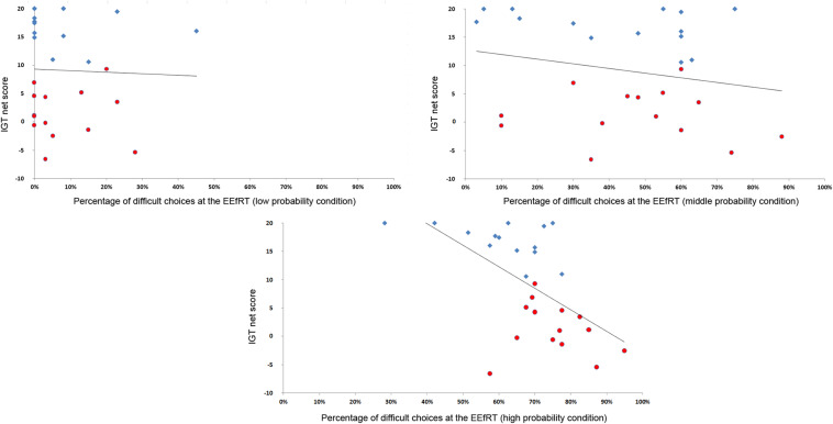
FIGURE 1.
Correlation between the netscore at the IGT and the percentage of difficult choices. The more participants developed a correct strategy at the IGT, the less they selected difficult choices at a probability of 90%. For visualization purpose, participants of the advantageous group are represented in blue diamonds and participants of the undecisive group in red circles.

