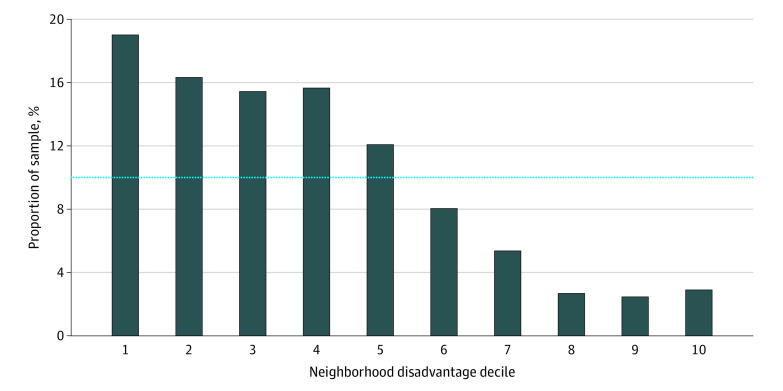
Figure 1. Neighborhood Disadvantage Within Decedent Sample.
Neighborhood disadvantage measured by Area Deprivation Index percentile rankings, ranging from 1 (least disadvantaged decile neighborhoods) to 10 (most disadvantaged decile neighborhoods). Bars denote the proportion within each neighborhood disadvantage category for the study sample. The dotted line represents the proportion within each category for the United States.

