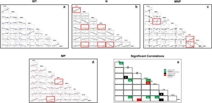
FIGURE 2.

Protein‐pair correlation data from western blot results. Panels a–d show correlation data for wildtype (WT), nulliparous (N), multiparous nonprolapsed (MNP) and multiparous prolapsed (MP) mice with lines of best fit for each possible combination of proteins studied. Red boxes indicate significant correlation in expression amount between protein pairs (p < .05), or a statistically significant line fit. +/− indicate positive and negative correlations between protein pairs, and can be visualized as significant line fits with positive or negative slopes, respectively. In these scatter plots, the slope of the regression line estimates increases in the dependent variable for a unit change in the independent variable while correlation measures the strength and direction (positive or inverse) of the linear relationship, independent of the units of measurement on the two axes. Significant correlations are unrelated to slope of the regression line but rather indicate that the points in the scatter plot are closely fit to the line and provide information on whether the trend is increasing or decreasing. Panel e summarizes the data for comparisons showing statistically significant differences between correlations using repeated measures mixed regression methods with pairwise comparisons corrected with a Bonferroni correction (denoted by *, p < .05). No data were excluded as an outlier
