Figure 1.
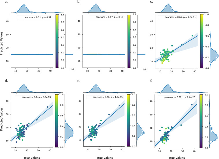
True versus predicted test values from BUN level prediction. Scatter plots showing the true (x-axis) versus predicted (y-axis) test values using: (a) gene expression data as training data, (b) chemical structure information as training data and (c) both gene expression and chemical structure as training data. Scatter plots showing the true (x-axis) versus predicted (y-axis) test values using gene expression and chemical structure as training data after: (d) PCA using 57 components, (e) tSVD using 57 components and (d) tSVD h. All scatterplots show marginal histograms with regression and kernel density fits. The 95% confidence interval for the regression estimate is drawn using translucent bands around the regression line. Datapoint colour is according to the standard deviation of the predictive distribution per point; scales for colour vary between plots. Figure (f) shows our best model.

