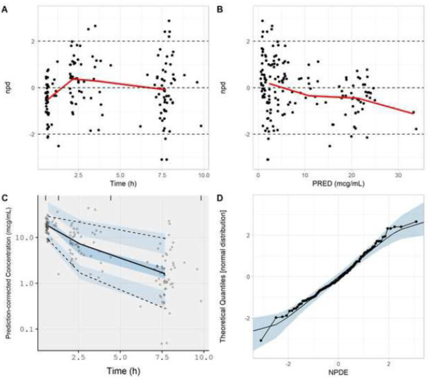
Figure. 5.

Goodness-of-fit plots generated from the NPDE-based model evaluation workflow corresponding to all subjects (N=29) from whom clindamycin concentrations were collected. Model simulations incorporated a residual error (exponential) of 0.422. Plots include npd vs. time (A); npd vs. PRED (B); a prediction-corrected visual predictive check (C); and a normal quantile-quantile plot of NPDE values (D). In A and B, red lines represent moving (local) averages. In C, the light blue shaded regions represent 90% prediction bands associated with the 5th and 95th percentiles of PBPK model simulations. The dark blue region represents the 90% prediction band associated with the 50th percentile of PBPK model simulations. Dashed lines represent the 5th and 95th percentiles of observed data; whereas, the solid line represents the 50th percentile of observed data. In D, the light blue shaded region represents the 95% prediction interval for a standard normal random variable (based on 1000 iterations). The solid line represents the 50th percentile of the standard normal random variable.
npd, normalized prediction distribution errors; NPDE, normalized prediction distribution errors; PRED, median simulated concentration
